La Mesa RV website redesign
Impact: Led a full website redesign, using behavioral data and design system to drive a 40% increase in lead submissions and 84% faster form completion.
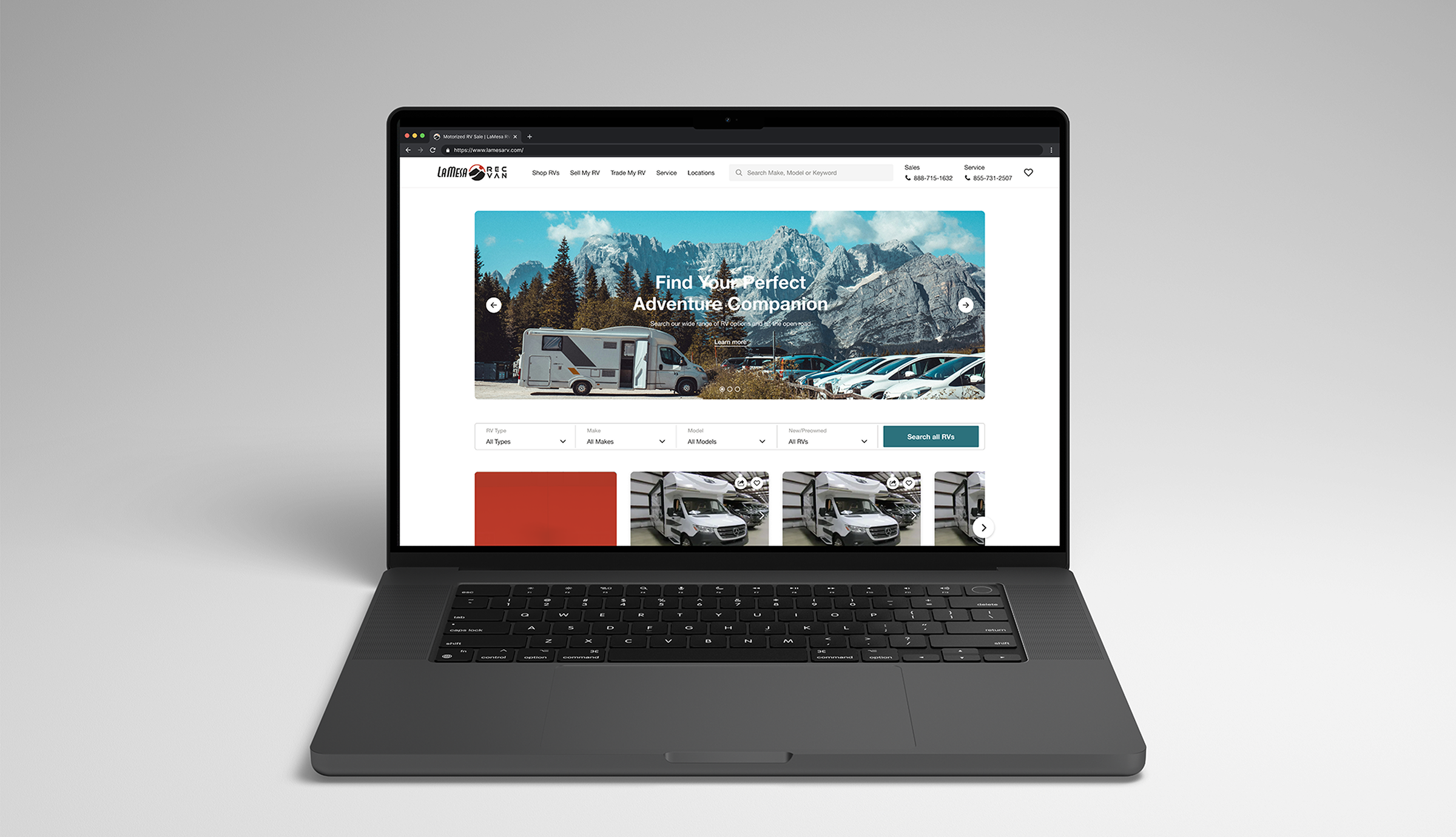
The existing site was outdated, inconsistent, and not built for its primary audience. Many pages lacked structure, branding was fragmented, and key flows like inquiry forms and product browsing were underperforming.
The core audience was 55+, but the experience did not reflect that. The goal was to understand where users were struggling and redesign the experience using real behavioral data.
Discovery
I started with Google Analytics to identify drop off points, then used FullStory session replays and heatmaps to understand behavior. I saw repeated form retries and rage clicks, especially in inquiry flows. The issue was not intent, it was friction.
On product pages, heatmaps showed deep scroll behavior. Users were engaged and reading, but when they were ready to act, the form was already out of view. That insight directly led to the sticky CTA decision.
Design System
Before designing pages, I built a token based design system in Figma covering color, typography, spacing, and layout structure. Components were designed specifically for ButterCMS, with real implementation constraints in mind.
One major limitation was that marketing teams struggled to create landing pages easily. To solve this, I designed flexible section based templates that allowed teams to add and rearrange content without breaking layout or consistency.
Brand conflict
Midway through the project, the brand shifted from a cool tone system to a warm palette, which conflicted with the design system I had already implemented across the site.
I worked with stakeholders to evaluate the impact and pushed to retain the cool tones, since users were already familiar with them and the site already had that established visual identity. This avoided a full rebuild and kept the experience consistent across all pages.
Mobile first
Everything was designed mobile first. Components were optimized for thumb reach, readability, and real usage contexts like browsing outdoors. The 55+ audience defined the design approach.
Accessibility was not treated as an add on. It shaped layout, spacing, and interaction patterns across the system. I increased base font sizes, improved hierarchy, and moved to higher contrast color combinations.
Product page
The old product detail page opened with a wall of text, buried the unit image, and had no pricing hierarchy. FullStory showed users scrolling deep before acting, with the inquiry form only at the top.
I redesigned it with a full bleed gallery, scannable pricing, specs above the fold, and a sticky CTA grounded in scroll depth data. The result was an 18% increase in form submissions and a 6.95 second drop in median form completion time.
Pricing
The old product cards displayed MSRP, discount, and sale price all at the same visual weight. Nothing guided the eye. I redesigned the pricing hierarchy so the primary price dominated and discounts supported it.
Price Too Low To Show was a legal constraint the company had always used a generic label for. I worked with the team on the UX writing and turned it into a deliberate gated reveal. Users who clicked through converted at 12.24% compared to 2.27% on the standard path.
Scale
Every page was designed across mobile, tablet, and desktop, accounting for orientation changes that shifted the UI meaningfully.
The design system made this possible without the work becoming inconsistent or unmanageable. New pages could be assembled from existing components without starting from scratch each time.
Reflection
The most important decision on this project was building the system before building the pages. It created a foundation that could absorb change, scale to 15+ page types, and give developers a clear implementation path.